Privacy settings
We use cookies to make our site user-friendly, to continuously improve it, and to analyse access to our website. You can find more information in our privacy policy. You can change your decision at any time in the impressum.
Using apps, operating machines or surfing the web: digitalisation occurs in all areas of life and is taken for granted. Nevertheless, there are target groups that need special consideration. The info page www.minitender.info takes digital accessibility into account.
The info page has been online since June 2021. The current release supports digital accessibility and includes the following improvements:
The individual innovations briefly explained:
A user can set the bright or dark mode on his or her device in the settings. The MTM info page will adjust this and display the page to the user according to the settings made. Switching to bright mode is possible at any time on the info page. The dark mode can also be combined with the high-contrast mode.
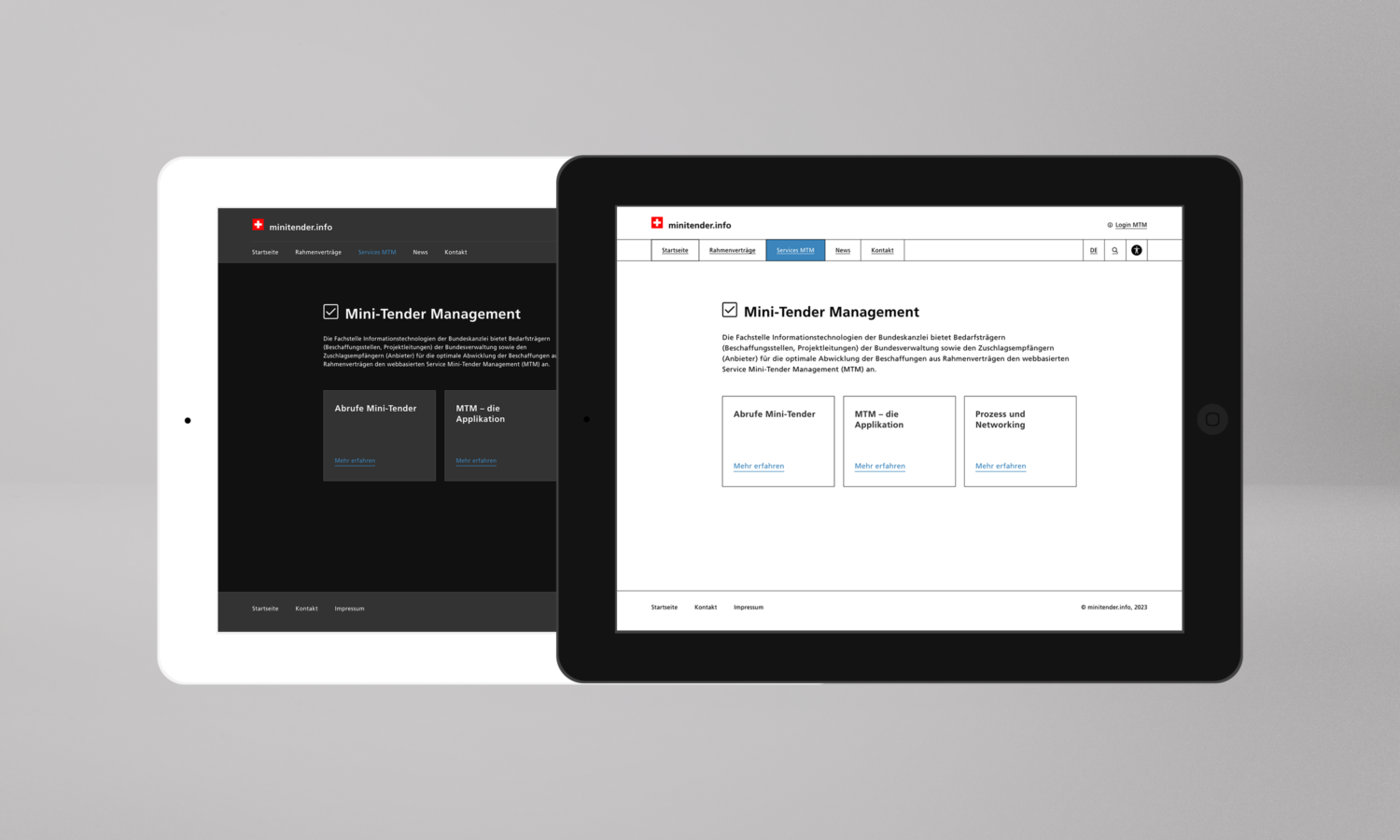
Mockup with bright and dark mode
Design elements such as the header or the navigation are better distinguished. The tiles are contoured and the font size is significantly increased.
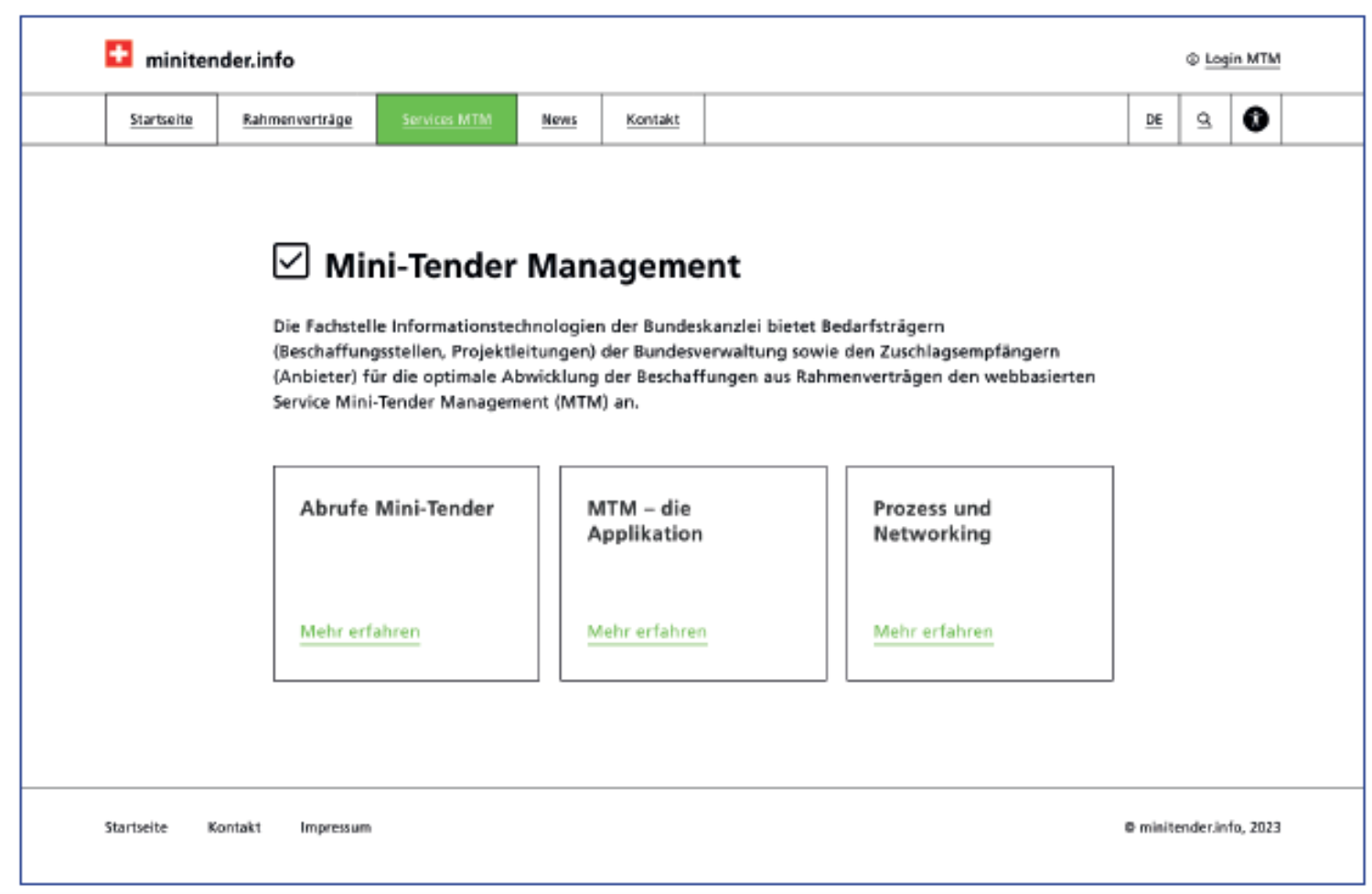
Mockup with high contrast mode
The user can choose the colour accents on the information page. Links and menus are then displayed in the selected colour.
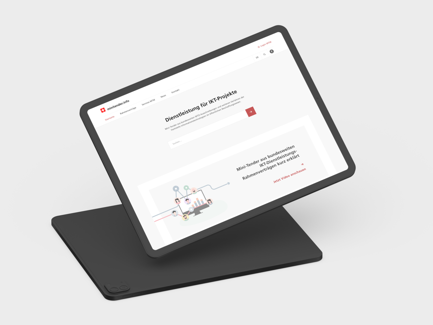
Mockup in bright mode and links in red colour.
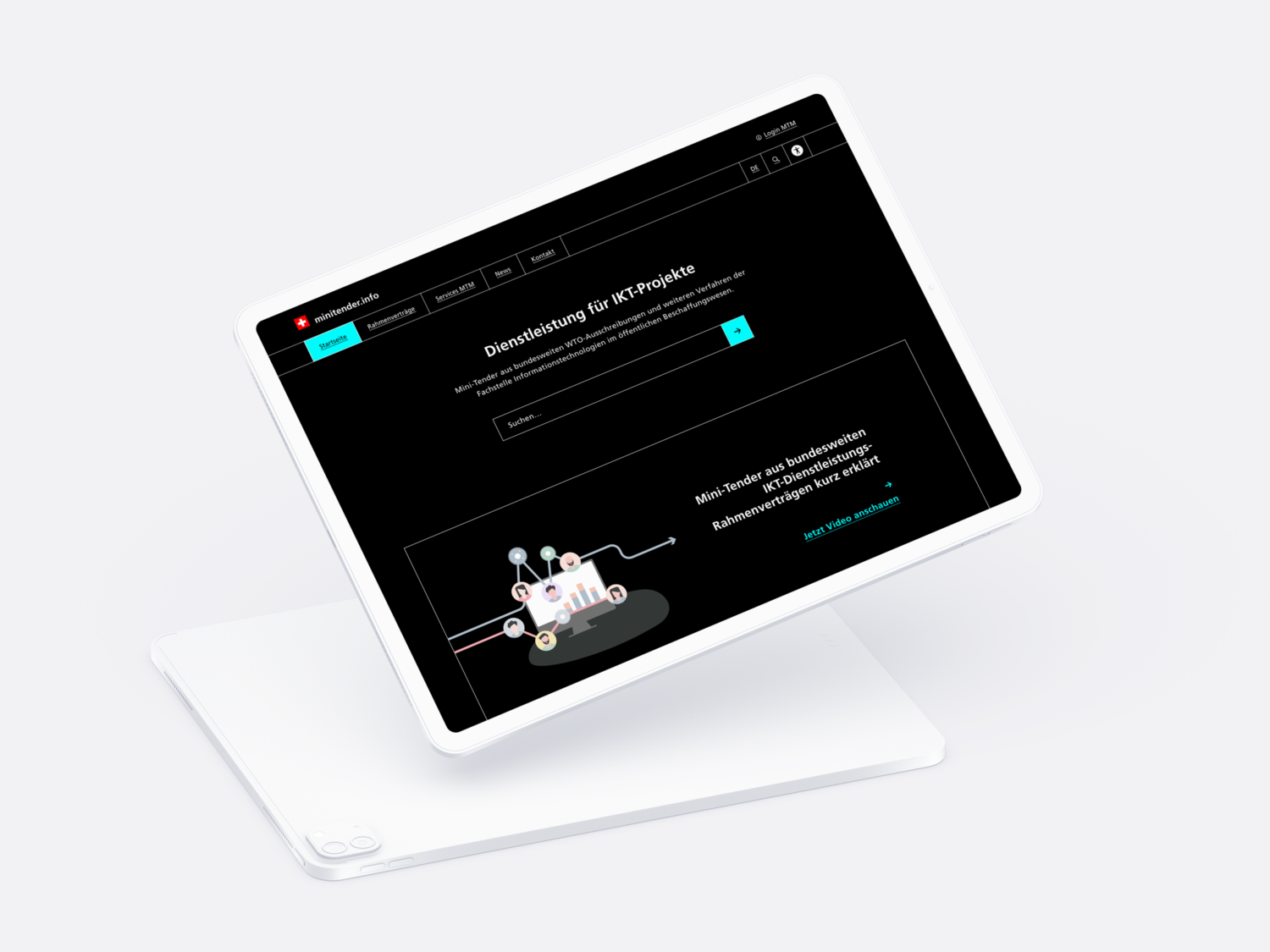
Mockup in dark mode and links in turquoise colour.
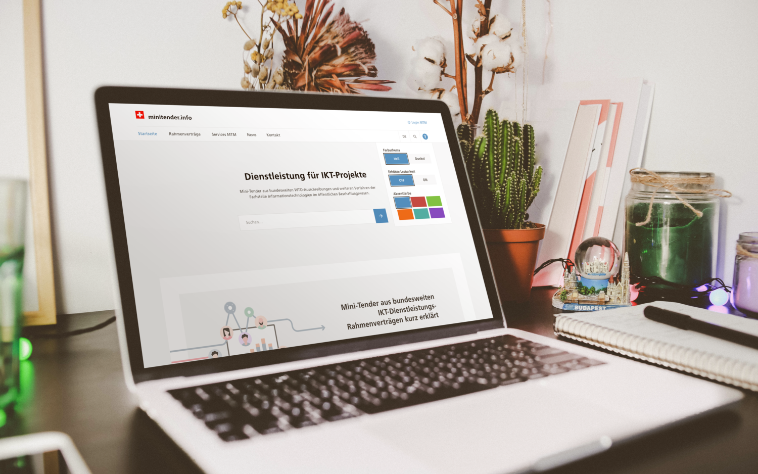
Mockup with colour palette in the accessibility menu
The menu of the accessibility mode contains an option to reduce the movements on the page.
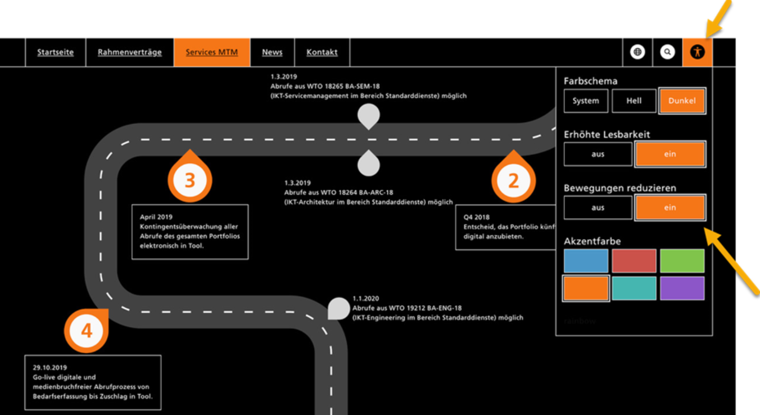
Mockup accessibility menu an option for reduced animation
Digitale Barrierefreiheit – Jetzt! (barrierefreiheit-jetzt.ch)
Eidgenössisches Büro für die Gleichstellung von Menschen mit Behinderungen EBGB (admin.ch)
eCH-0059 Accessibility Standard Version 3.0
Hilfsmittel für eine barrierefreie digitale Kommunikation (admin.ch)
Geschäftsstelle E-Accessibility Bund (admin.ch)
All links are available in German and French, partly in Italian.